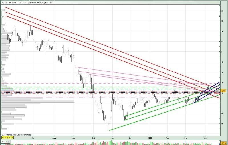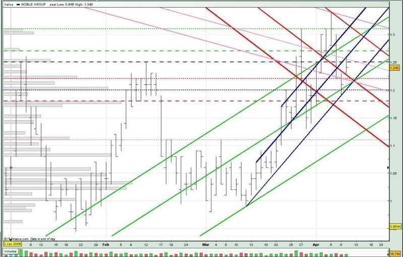
The red trendlines indicate long term downtrend, the pink ones indicate short-term downtrend, the green indicates long term uptrend, and the blue ones indicate short-term uptrend.
Let's now take a closer look.
Noble Group was trading within a tight 3 cent range today, which was not quite its usual trading range. Almost 3/4 of its trades (455 trades) were done at the 1.24 level (12,004 lots - with almost the same amount of buy ups and sell downs, and 1 married deal of 1,400 lots).
After breaking the long term downtrend support (mid red) yesterday, Noble Group managed to recover today and traded above this support, and also tested the short-term uptrend resistance (mid blue) and short-term downtrend resistance (mid pink). However, it failed to break the 1.25 neckline (blue --) convincingly.
As you can see from the chart, 4 trendlines (low pink, low blue, mid green, mid red) converge at about the 1.215 level. So this could mean that the 1.22 / 1.21 support could be crucial. If this support breaks, we could see Noble Group re-testing the 1.20 support (blue ...), or even the 1.18 support (red --).
However, if Noble Group can continue to trade within the 2 uptrend channels, and stay above the 1.22 support (red ...), we could see it test the 1.25 neckline (blue --) soon, and maybe even the 1.27 resistance (green --). Any upside would probably be limited to the 1.31 resistance (green ...).

For monday :
Support @ 1.22 (low red, red ...), 1.216 (low pink), 1.21 (low blue, mid green), 1.20 (blue ...), 1.18 (red --)
Resistance @ 1.25 (mid pink, blue --), 1.27 (mid blue, green --), 1.287 (upp green), 1.31 (upp red, green ...), 1.32 (upp blue), 1.33 (upp pink)


No comments:
Post a Comment